Creating a Column Control in Adobe CQ
Published on by Dan Klco
Column Controls in Adobe CQ allow authors to easily create and configure column-based layouts. This guide shows advanced users and developers how to create and configure a column control.
Step 1: Add a Parsys to a Component JSP
Include a Paragraph System into the page’s component JSP. You can use any node name for the path, the resource type is ‘foundation/components/parsys’
<cq:includepath="par"resourceType="foundation/components/parsys "/>
Step 2: Configure the Paragraph System
To add a Column Control to the Paragraph System, you will first need to update the design. Select design mode on the sidekick.
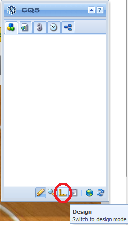 Selecting Design Mode
Design mode allows you to configure the Paragraph System for all pages with the same template. Once the page has reloaded, select Edit next to ‘Design of {NODE}’
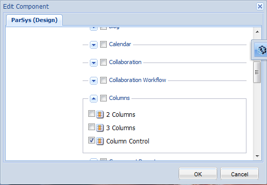 Selecting Column Control Component
Look down through the list of available components and expand Columns. Select Column Control and then press OK to save your design changes.
Step 3: Add and Configure the Column Control
Switch back to edit mode by expanding the sidekick. In your new Paragraph System and select New’ then select Column Control from the available components.
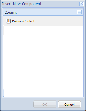 Inserting a Column Control
Once the page reloads, you should see your new Column Control on the page. Select the edit design button on the sidekick to configure the column. Now you should see two entries in design mode. Select edit next to ‘Design of colctrl’ to edit the design of the column control.
The design for the Column Control has only one field. The Allowed Formats controls what options will be available for authors for using the column control. Each format is separated by a new line and the various fields are separated by characters. The fields for the allowed format are:
- Number of Columns ‘ Used to determine the number of columns in which CQ will allow you to add components.
- Column Class ‘ Used to set the class for the Column Control HTML. This should be a class in your CSS stylesheet.
- **Format Label ‘ **Displayed to the user when the select which column format to put on the page.
The format for each fields are as follows:
[Number of Columns] %2B ‘;’ %2B [Column Class] %2B ‘t’ %2B [Format Label]
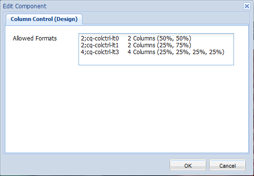 Editing the Column Control Design
Enter the formats you want to have for your Column Control, remembering that each CSS class should be unique. Select OK to save your changed and expand the sidekick to switch back to edit mode.
Step 4: Editing the Column Control
One you have configured the column control, you can edit it. First, select Edit next to ‘Start of 1 Columns’. This will bring up a dialog for you to select the Column Layout to use. Once you click OK, the appropriate number of drag and drop fields will appear in the Column Control.
 Adding Components into the Column Control
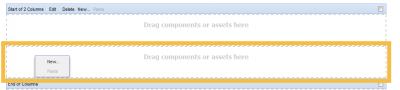
Right click inside each column’s drag and drop field and select ‘New’’ to add components into the column.
Step 5: Update Stylesheet
Finally, to make the column display correctly, you will need to update your CSS stylesheet. The column control will have the classes ‘parsys_column’ and the Column Class you specified in Step 3. Each column will have the classes ‘parsys_column’ and the Column Class you specified in Step 3 with ‘-c[Column Number]’ appended. The column number is a zero based index.
For example if my Column Class was ‘cq-colctrl-lt0’ the second column would be ‘cq-colctrl-lt0-c1’.
For more information about using CSS to style columns read the following guides: